“To the Letter: Aleph – Z” by Ariel Burger and Matthew Carter is a revelation. It is symbolic of East meets West, and Hebrew letters playing off of Latin letters, and vice versa. Each artist has a clear attachment to his alphabet of choice. Hebrew letters and their mystical possibilities fascinate Ariel Burger, and the Latin alphabet has been Matthew Carter’s life’s work.
Their art, displayed in adjacent rooms at Mayyim Hayyim’s gallery, is in conversation. As author Anita Diamant, Mayyim Hayyim’s founding president, who introduced the artists last week, observed, the Latin alphabet is her Jewish alphabet: “These Latin letters are the language of great Jewish writers from the past and the present. Great Jewish fiction writers—some deeply involved with the Hebrew alphabet—chose to use the Latin alphabet.”
“To the Letter: Aleph – Z” also marks the inaugural collaboration between the Jewish Arts Collaborative (JArts) and Mayyim Hayyim gallery. Laura Mandel, JArts executive director, said the new relationship reflects her organization’s commitment to supporting more programs focusing on the visual arts.
Burger, a rabbi, teacher and writer, is the recipient of a prestigious Covenant Award. He is also a writer who has a memoir due out in November about his relationship with his mentor, Elie Wiesel. Hebrew words and letters and their mystical properties have fascinated Burger since his school days. “We know that in Jewish tradition God creates the world through words,” said Burger at the opening.

Carter, an industrial designer by training and MacArthur Fellow, was also on hand to launch his rendition of the 26 letters of the alphabet, each in a different font he designed. The British-born Carter has been working with various typefaces for over 60 years. Seven of his original ones are in the collection of the Museum of Modern Art in New York City.
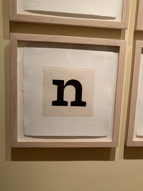
The 26 letters on display on the gallery’s wall are Carter’s favorites and represent the myriad styles he has designed. All the letters are lowercase, and with the exception of the letter “n,” which was specifically designed for the current exhibition, the rest of the letters represent distinct typefaces already in use. “I was accustomed to a completely different relationship with the letters,” said Carter. “I had to avoid making [the exhibit] look like a ransom note, and that was difficult. I realized that I had to plan all 26 letters, and I changed my mind several times. But the planning has taken me to places artistically I would otherwise not go.”
Master printer James Stroud was also on hand at the opening to explain the process of etching Carter’s letters into copper plates with aquatint. Stroud noted that he started production in 2017 and completed 35 sets of the letters. He said many of the alphabet prints have gone to museums, including those at Yale and Harvard. Corporations and individuals have also collected them.
Burger traces the beginning of his artistic career to adolescence. “Imagine 20 boys being introduced to the rich, confounding world of Talmud, with its questions and answers and challenges and responses,” observed Burger. He then asked his audience to imagine one boy in the room who is also drawing—drawing until his pictures begin to encroach on the text of the page. Those drawings are displayed in the artist’s actual Talmud from his youth. Burger said the show’s curator “had a stroke of genius” to display the volume along with pieces of texts that have various figures, such as mermaids and fish drawn over a page of Talmud.
Carter pointed out that curating his part of the show was deceptively simple. Although the letters “o” and “c” appear to be the easiest letters to create, “They were by far the hardest. In an ‘o’ or a ‘c,’ if I make a wobble in the outline, you will definitely see it. There is nowhere to hide. My goal was to see these letters in a different way. They’re not decorative letters. They are typefaces for immersive reading.” To that end, The New Yorker once described Carter as the most widely read man in the world considering the amount of text set in his fonts.
For Burger’s part, a large “aleph”—the first letter of the Hebrew alphabet—anchors his side of the room. Burger said that for him, “This process has been not only about exploring the relationship between text and image, but also about looking at text as image. Letters become windows into some universe of discourse that is often surprising. That is where creation happens, and that is where my experience of creativity happens too.”